Wooooosh! This first quarter of 2022 flew by! What happened?
Well, the launch of our new plans was pretty successful. Tons of teachers and course creators just starting out have taken advantage of our Spark plan. It’s perfect for new websites and/or small courses and super affordable.
Because of some of the infrastructure changes, we were able to increase the amount of storage and bandwidth we can offer. So our Polaris customers paying $29/month and getting 100 GB of storage and 100 GB of bandwidth were able to switch to our new Polaris account and pay just $20 more per month for 6 times the amount of storage and bandwidth (new Polaris plan is $49/month with 600 GB of storage and 600 GB of bandwidth).
You can get all the details on our new plans on our Pricing page.
And we also switched from offering a Free Forever plan, which had very limited features, to offering 2 week trials to our plans. You can register for a trial without a credit card and have full access to all features for a full 2 weeks.
We released some nice features enhancements to our Quiz Module and spent the rest of the time squashings bugs and building our app interface. We decided to rebuild a few things rather and repurpose code, so the beta release will be delayed by a few months. But in the end we are looking forward to simpler and more intuitive interface that hopefully people will love!
We also began work on our new WordPress plugin which will enhance the experience for anyone using WordPress (and especially those of you using LearnDash).
March 31, 2022 – Current platform version 4.2.63
Features Added
Improvements
Upcoming
- New trials for all plans
- Various new features for Quiz Module
- Added subscribe options from billing
- Tap to call improvements
- Optin bar improvements
- Quiz timeline interactions
- Fullscreen iOS behavior improvements
- Updated list of languages for subtitles
- Team accounts and themes fix on ENTERPRISE / STARTUP
- Share link custom start time fix
- Email gif improvements for HLS, freeing 1st sec
- Bugfixes on missing or incomplete user and playerSettings data
- Youtube handling and thumbnail improvements
- Pre and post roll video fixes
- Update storage after any video import
- Gallery revenue users and consumption rates
- Updating theme timeline position fix
- Transcribe errors fixed
- YT API source update
- Custom Thumbnail w/ Disable preload fix
- Switching resolutions continuation improvements
- Fullscreen enter / exit fixes
- Added ability to export gallery access codes
- Stripe Webhook error fixes
- Pre roll zero display fixed
- Increased default upload limits to 10GB per file
- Improved engagement chart display
- Thumbnail loading order improved in favor of CDN
- Updated video transcription audio generating property
- Improved handling of gates locks when creating
- Thumbnail handling, image and video improvements
- Removed overlays & actions from video insights
- Fixed gif generation from video edit page
- Analytics disregarding ignored IP listings
- SMART playback issue fixed
- Updated style of player notifications
- Vimeo migration process (include resolutions, thumbnails, correct storage, deletion etc.)
- Quiz questions now allowed at same time
- Disable right click on video
- Player alert notifications in full screen
- Theme icon color bug resolved
- Gallery: Video to open bug fixed
- Removed all fast forward animations
- Gallery: Warnings displayed when embedded
- Additional resolutions available for vimeo hybrid
- New application user interface
- WordPress plugin
- Live streaming
Spotlightr Quiz Module Improvements
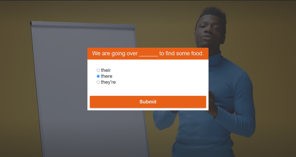
We’ve released some added customizations as well as better looking quiz questions overall to help you keep everything on brand.
Here’s how a simple single choice question looks for example:

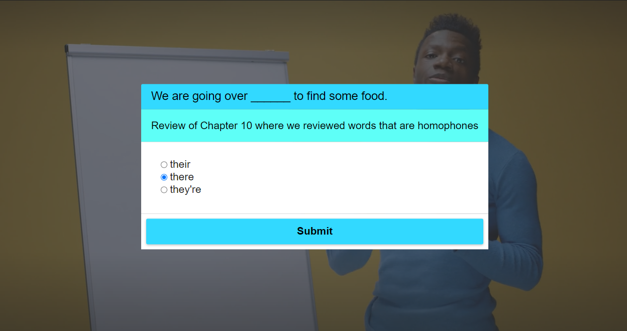
Now I’ll add a description and then change the colors. The colors of the question, the description, and the button are all cusomizable.

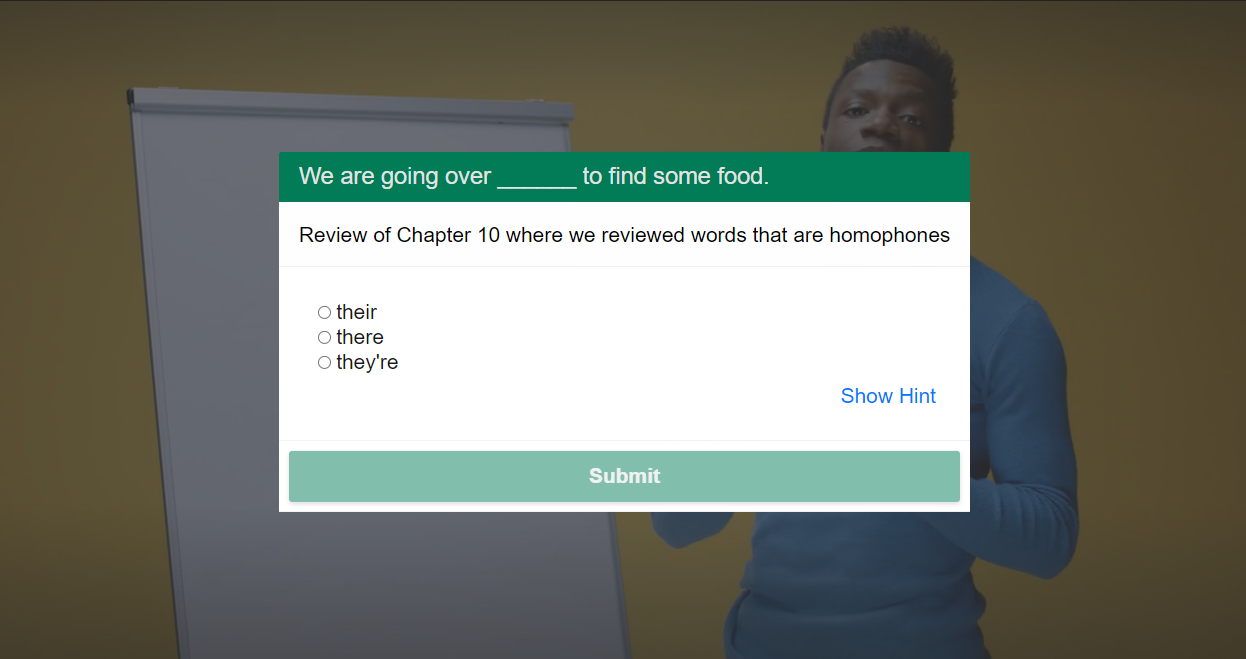
In this example, I changed the question and button colors to a dark green and changed the description to white to match the question background.
You’ll notice there is now a “Show Hint” text which is not clicked yet. And the “Submit” button is faded because an answer has not been selected yet:

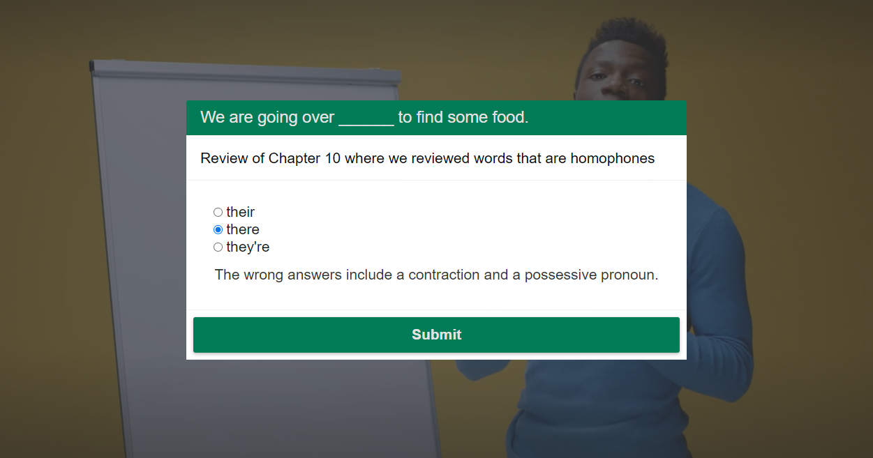
Now you’ll see I clicked to reveal the “hint” and selected an answer. Once an answer is selected, the button fade is gone and the button is now clickable.

Here’s a video with some quick examples. The first question is single choice and the second is a text answer.
The third is a “crossroad” question where you can choose an event based on what answer is selected. Here are the events you can use:
1. Contine – This just continues on with the video
2. Jump to time – This jumps to a different time in the video
3. External link – This redirects the viewer to any URL
4. Change video – This switches the video immediately to another video
In the example below, both answers are using the “External link” event 🙂
Here’s what’s next…
The WordPress plugin should be ready for beta testing in early May and the completely new app interface in June.
As I mentiond in our last release notes, the new user interface will be more simple to use, more intuitive, and designed specifically for our core market which is online educators and course creators.
That’s all for now! In an upcoming article I will share with you some “sneak peeks” at our new app and user interface.

